The Brief
When ING came to Fabrique with the wish to make a web-based version of their Annual Review 2014, we were confronted with a number of challenges:
- How can we make a text-heavy document easy to read for everyone?
- How can we tell an interesting story to people with limited interest, while also presenting the in-depth story to those who seek that?
- And lastly, how can we create a continuous flow from a document that has a lot of explanations, side-stories and multiple chapters?
- How can we tell an interesting story to people with limited interest, while also presenting the in-depth story to those who seek that?
- And lastly, how can we create a continuous flow from a document that has a lot of explanations, side-stories and multiple chapters?
keeping the flow
Because we had a fairly complete draft of the print version of the annual review, we at least knew which content we had to work with. By analysing this content, we came up with a couple solutions to adapt the text to a web version.
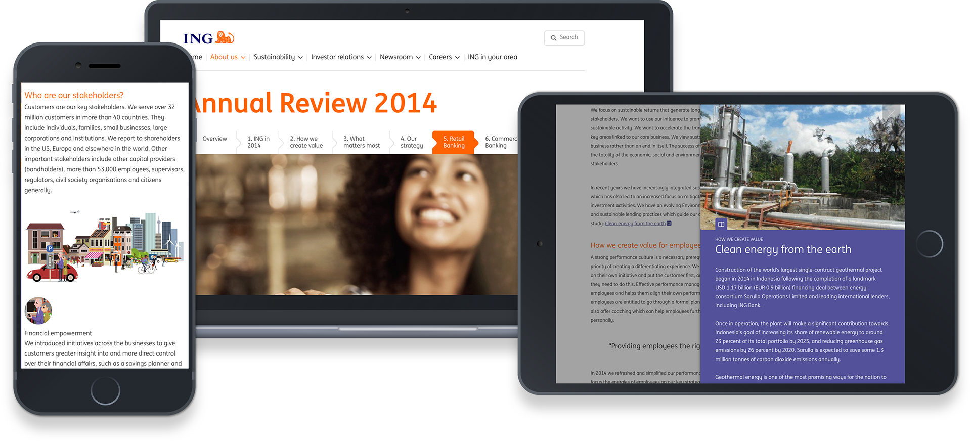
One of the core principles of the project was to always keep the user in the flow or reading the annual review. That’s why we created ways to anchor the user to the main text whenever they jumped to editorial pieces & detailed descriptions (this is where the side-bar comes in), or when they jumped to the next chapter (seamless transition).
as light as a magazine
Another goal was to make sure the entire story was just as pleasant to read on your iPad during breakfast, as it was while looking on your phone during a commute. We wanted the Annual Review to feel as light as a magazine. With the help of using enough white space, illustrations & photography and break-out pieces we managed to make the whole document a lot more digestible.
By making everything fully responsive, we were able give the full experience without any animation or interactivity concessions; on any device.
By making everything fully responsive, we were able give the full experience without any animation or interactivity concessions; on any device.
Credits
Role: Interaction design and scrum master while working at Fabrique
Technical realisation: Bedrock