context
When I started at DashTag (early 2018), the founders had already built a solid foundation. They had done hundreds of hours of research, designed the hardware and were ready to ship it for US players to start testing. 
Where they needed someone to add value was to help shaping up a brand identity, establishing design principles, and set up the interface design. My role extended beyond the traditional definition of interaction design, I was fully responsible for the complete user experience..

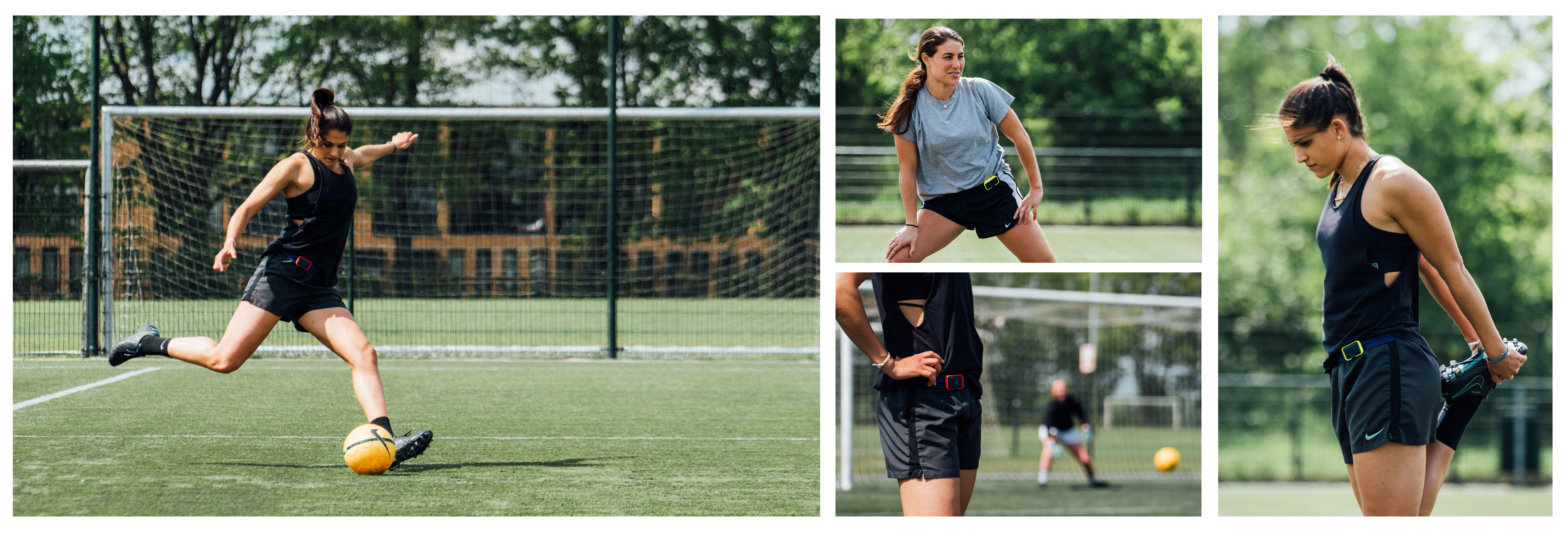
The soccer tracker - called 'the Dash' - being used by Kim, Sam and Cassie from PSV Eindhoven.

Challenges
After I got acquainted with the product, the stats and the target audience, we were able to identify the main challenges we were up against: 
1. Set up a brand that stands apart from the competitors. We needed something easily identifiable and something that speaks to our target audience.
2. Creating a way to make easy to understand analytics for people who don't necessarily want to see analytics. 
3. Engaging the gnarliest, most difficult and most distracted target audience; teenagers ranging from 13 to 20 years old. 
In short: we needed to come up with something young soccer players would love to use. 

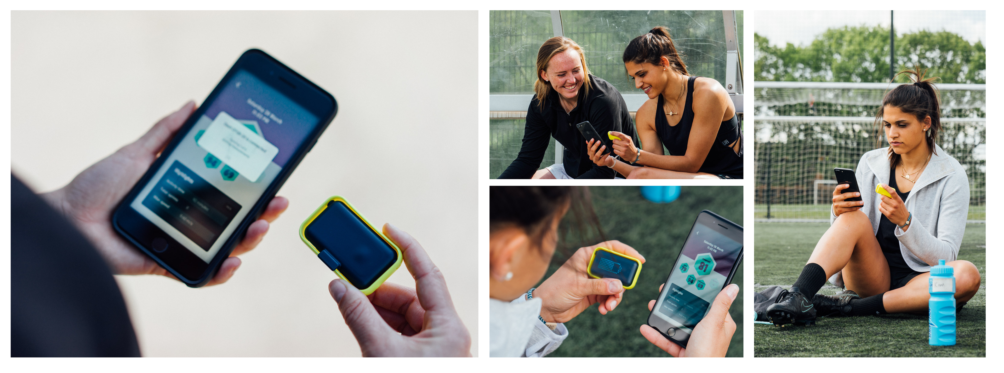
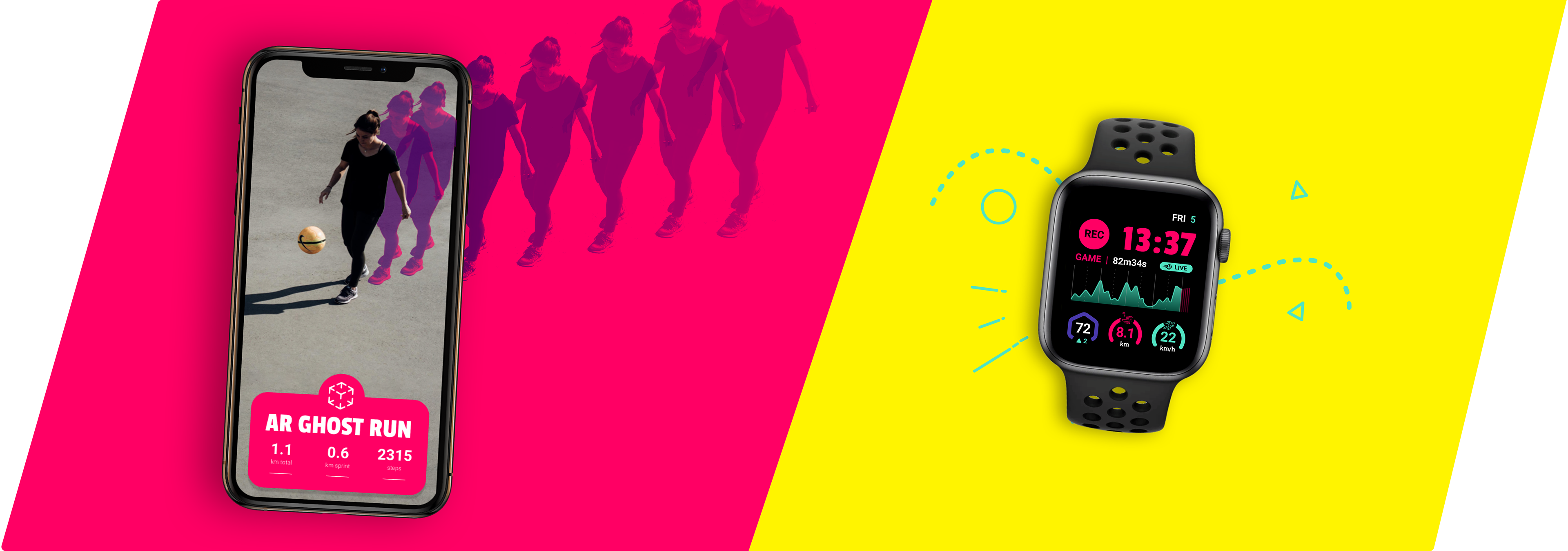
Some examples of the Dash interacting with the beta version of the app

Brand identity
One of the big undertakings was finding the right identity that goes with the company DNA and the physical product. We started this expedition with Angela (from March) who helped set up the packaging and apparel design. While the packaging was eye-popping and captured the spirit of our startup, it was not suitable for digital use in the app.
That's where we worked together with Thijs from Superbruut to grow and expand the brand identity with specific digital guidelines.
In the end, we stuck to the bold colours, but got rid of (most of the) gradients. For an interface to makes sense, we needed to keep it clean and light, so we could give some room for elements to pop. This way, the app has its own identity but is still in harmony with the packaging.

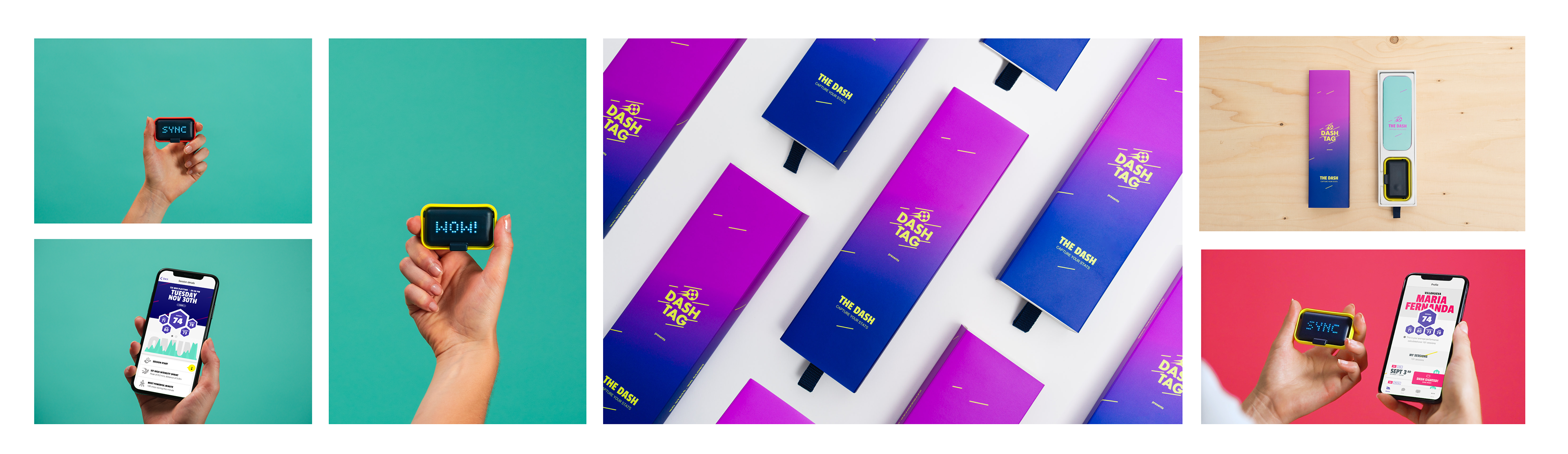
The complete package: Dash, app and packaging.

To explain the concept and working of the app (and tracker) we decided to keep the manual included in the box as tiny as possible (teenagers don't read manuals). 
To replace an extensive user guide, we made a video to explain how new players should use the Dash. With a soccer player (our colleague Jade) and a stylised setting, we shot 3 videos to show you how to snap the Dash on your shorts, how to record a session and how to sync it with your phone. Everything designed to match our other marketing materials. 
Easy to understand analytics
Looking at our competitors, ease-of-use is our strongest asset. Where other products require a vest (or bra) to contain the tracker, we managed to make a clip that mounts the tracker on the player's shorts. It's that type of thinking we needed in the app too.
That is why we came up with the FIFA score as the main classification of a recorded session. Originating from the FIFA game, this single number (between 50 and 99) immediately shows the player how well he or she has done. The five scores - pace, power, intensity, stamina and overall - give the player an easy reference of the game or practice.  
The vast majority of the male test players play FIFA on a regular basis, and all the female soccer players were at least familiar with the scoring principle. When we tested this beta version with the teams we got an overwhelmingly positive response. 

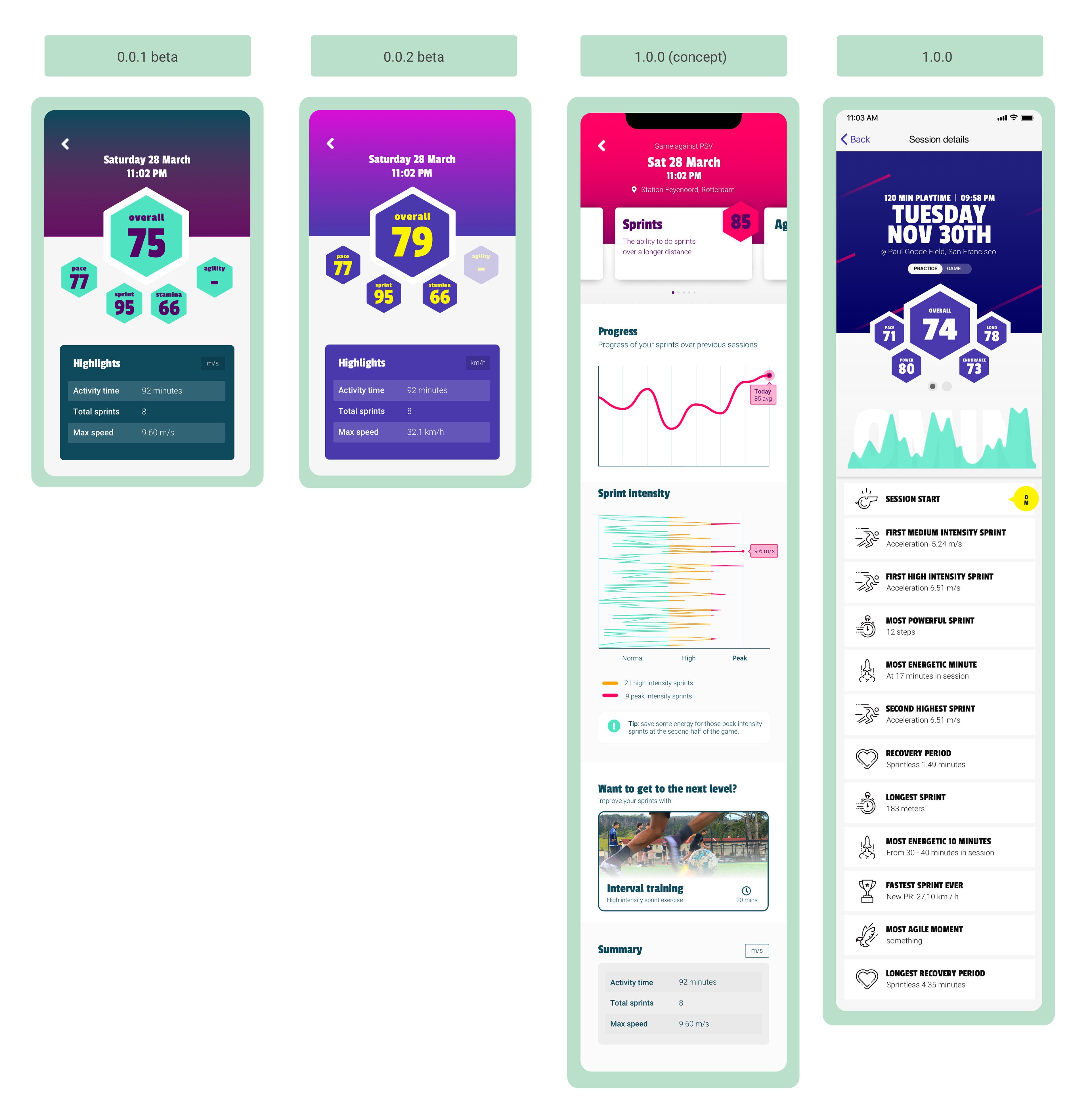
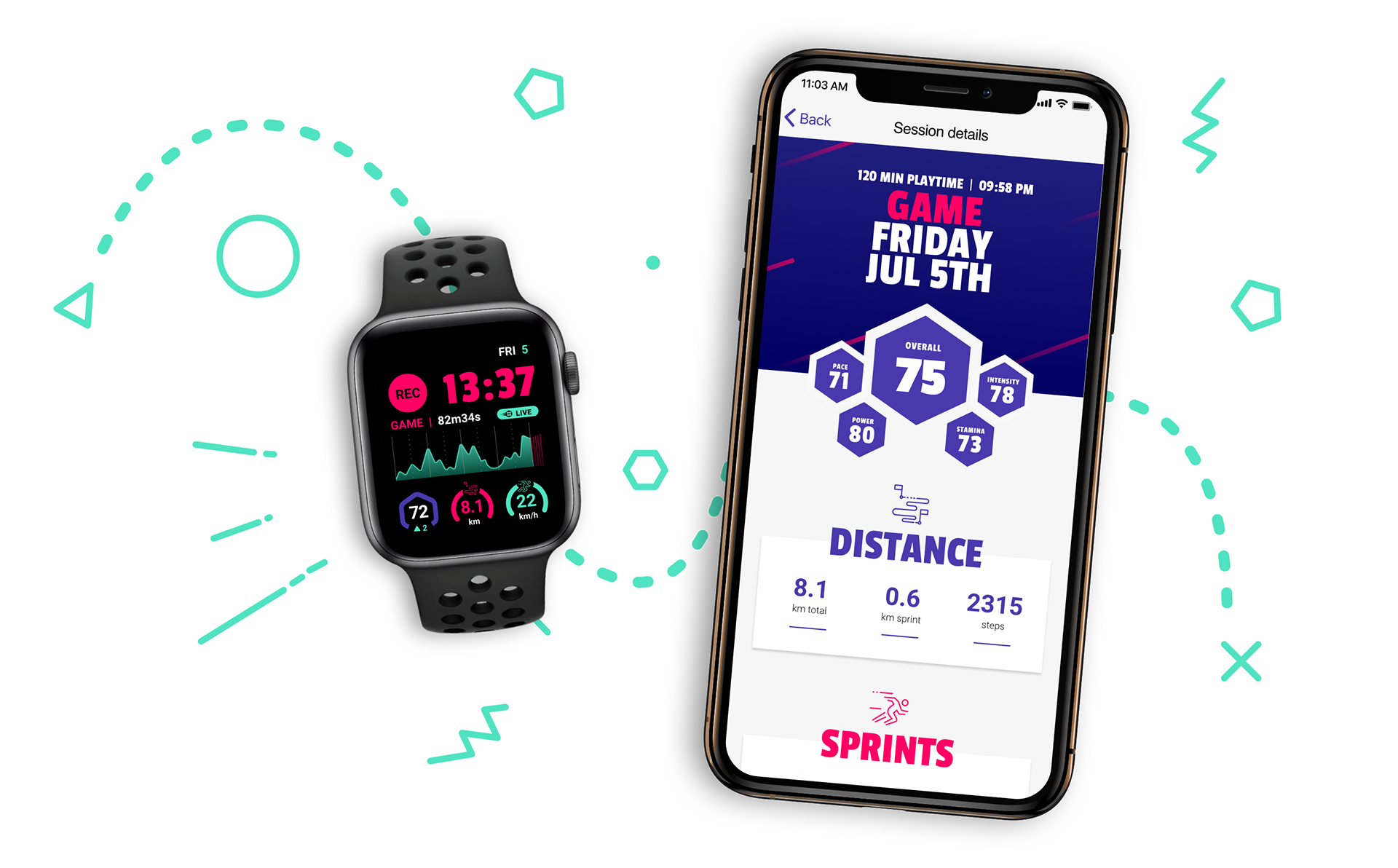
Evolution of the session detail page: 0.0.1 has the FIFA score and some additional stats. 0.0.2 has an updated colour scheme to match the packaging of the Dash. In between a concept to test out feature candidates for version 1.0. And the first public version (1.0.0) with the powerline and highlights as the newly added features.

Another big addition was the session breakdown into several highlights, telling you something about your performance. Some obvious, some not: like low active period (so you can see when in the game you allowed yourself to recover).
These highlights were plotted onto a graph (the powerline), showing your sprint intensity over time. One of the hardest parts was coming up with a graph that actually gives some easily digestible information but also looks good. 
Well, in the end reactions were positive but hardly anyone got what it actually meant. That's why we killed this darling for the latest version of the app; clarity before aesthetics.

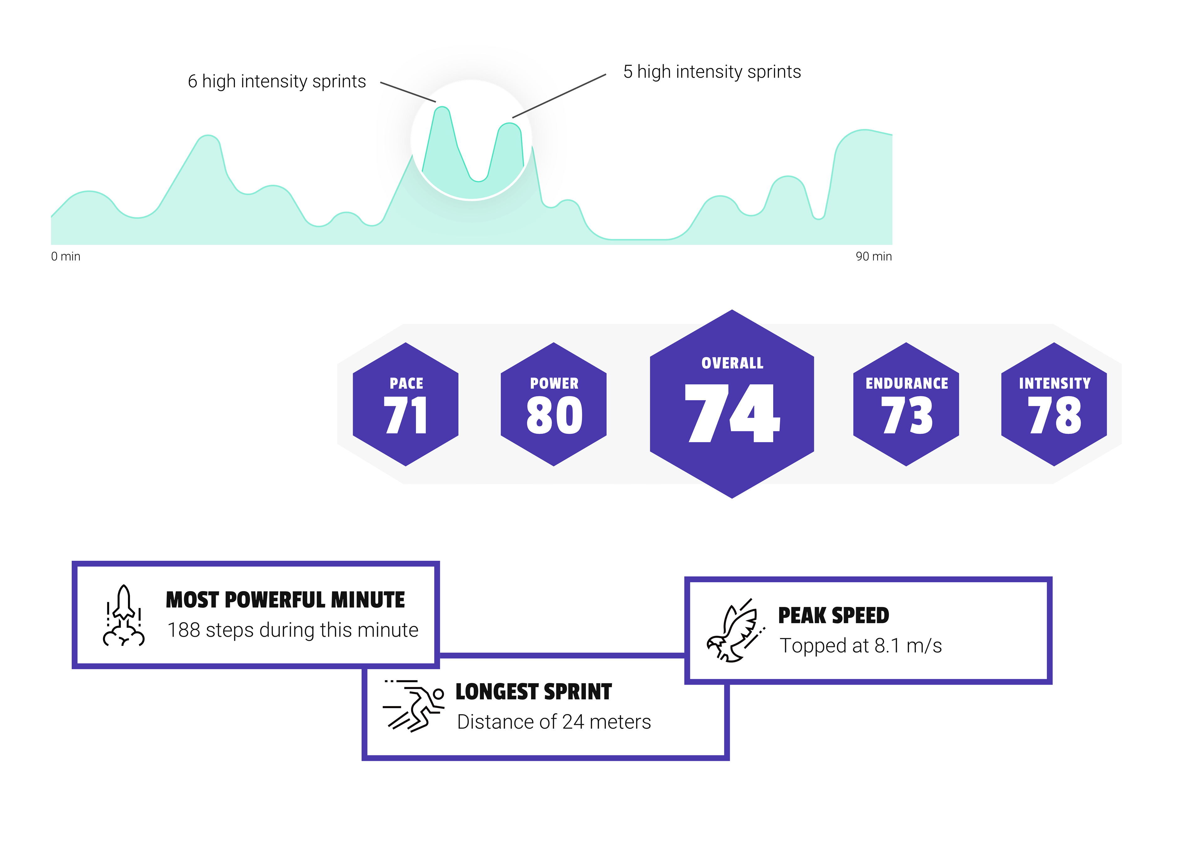
Stats version 1.0: From top to bottom: the 'Powerline', the 'FIFA stats' and the 'Highlights'.

Engaging the audience
After the launch of the product we went on to further update the product. A few pivots and corresponding app tweaks later, we launched a big new update. This release consisted of changes to the session detail page to make it even more user friendly. 
And we also introduced a big new feature: Chalk Talk. Because we found out that simply presentating stats to young soccer players is not enough we built this new section. It was the first step towards building a soccer community, and to go beyond a simple 'FitBit for soccer' product. 
In this section, soccer players all over the world can ask questions and react to them in a Reddit style posting system. A new level of engagement, for users with or without having our soccer tracker.

Promo video for the latest version of the app: new stats, chalk talk (Q&A by and for soccer players) and session tagging.

The latest design explorations I worked on where focused towards finding more ways of getting new players into the app and engaging the already existing ones. 
We took a week to learn as much as possible about Apple's WWDC19 announcements surrounding ARKit. We then sketched up a few exciting AR scenarios and made a tech-demo to prove that it is possible to actually get something up and running in a few days. 
After that, we fully focused on looking into the watchOS and the option to make stand-alone app on the Apple Watch. We designed a mockup for the interface and replicated the functionality of the Dash into a watchOS app proof-of-concept.
the story of the many hats
Apart from the continuous work on the app and validating our hypotheses, I also loved working on building a company culture as well as getting more structured processes within the small - but remotely working - team.
So I started to gather stories to add to a backlog to make sense of the work ahead of us, but also to neatly group everything in contained releases. Using post-its, Trello & Notion (to keep this organised with the San Francisco team) I managed to put a little of my Scrum / Agile DNA into the company.


From structuring workflows and coming with release codenames, to testing with users, print proofing and tryouts, making slidedecks for important presentations and helping out with content for the social channels (world cup tie-in), being the only the designer in the team meant helping out wherever possible.
Credits
Blood sweat and tears: My awesome team mates at DashTag
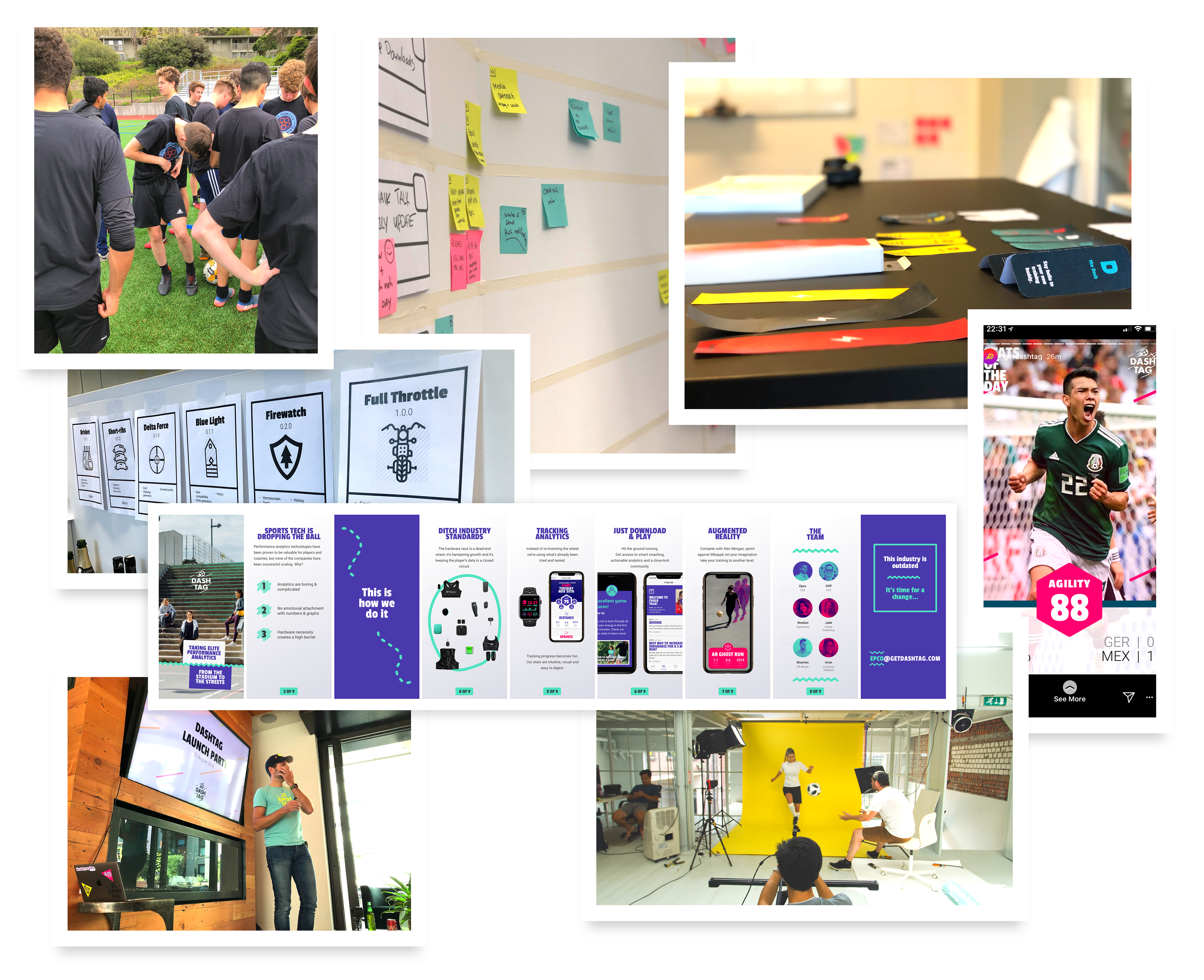
Product videos, photography and hardware design: form + function
Visual design concept: Superbruut
Packaging and logo: March
Website realisation: Bedrock

Back to Top